Our brands.
All in one place.
The CMG Brand Hub — a single source of truth for assets, guidelines, and resources across the entire group.
Our Company Values
Contribute to the Hub
Send asset requests, resources, ideas, or feedback to the Brand Team.
All Brands & Divisions
Navigate to any brand for full guidelines, assets, tone of voice, and AI prompts.
A Connected World
of Music
We are a global music industry operator, innovator, and investor connecting the world of music.
Our Values
The five principles at the core of everything we do at Caldecott Music Group.
Brand Identity
The guiding statements that define Caldecott Music Group as a whole.
Asset Bank
Search, preview, and download every CMG asset. Filter by type, variant, or format.
CMG Colour Palette
The official CMG colour values for use across all group-level materials.
RGB 215, 200, 38
CMYK 0, 7, 82, 16
RGB 66, 66, 66
CMYK 0, 0, 0, 74
RGB 26, 26, 26
CMYK 0, 0, 0, 90
RGB 255, 255, 255
CMYK 0, 0, 0, 0
Brand Assets
Everything you need to represent CMG — logos, templates, photography, brand elements, and more. All files live in Google Drive; click any card to open.
Divisions
CMG operates across three distinct divisions — each connecting the world of music in its own way.
The Future of Music
Here Today
A creator-first destination where anyone with access to the internet can make music, grow their audience and earn a living.
Brand Positioning Statement
Brand Personality
Three traits that shape every word, design choice, and interaction BandLab puts into the world.
Asset Bank
Search, preview, and download every BandLab asset. Use the filters to narrow by type, sub-brand, or format. Starting with logos.


Colour Palette
Prioritise red, black, and white. Accent colours should feel intentional and focused — never allow the palette to feel chaotic.
RGB 241, 44, 24
RGB 0, 0, 0
RGB 255, 255, 255
RGB 252, 201, 49
RGB 41, 219, 229
RGB 255, 105, 13
RGB 47, 147, 246
RGB 180, 0, 255
Typography
BandLab Sans — a customised version of Centra No. 2. Modern, approachable, and expressive across all weights and sizes. When BandLab Sans is not available, use Inter.
Tone of Voice
BandLab speaks like a supportive creative friend — energetic, inclusive, and culturally aware. Never a corporate tech platform or an authority figure.
Asset Library
Everything you need to represent BandLab — logos, icons, photography, and brand materials. All files live in Google Drive; click any card to open.
A Destination for Artists
to Launch Their Careers
The leading artist promotion platform — connecting independent musicians with the fans, industry professionals, and real opportunities they need to build sustainable careers.
Brand Positioning Statement
Brand Personality
Three traits that shape every word, design choice, and interaction ReverbNation puts into the world.
Asset Bank
Search, preview, and download every ReverbNation asset. Filter by type, variant, or format.
Colour Palette
A vibrant eight-colour spectrum — magenta leads, supported by orange, yellow, blue, green, and teal. Black and white anchor the system. No single colour dominates; energy comes from the spectrum as a whole.
RGB 240, 53, 221
CMYK 24, 81, 0, 0
RGB 245, 85, 27
CMYK 0, 82, 100, 0
RGB 245, 200, 3
CMYK 4, 19, 100, 0
RGB 92, 111, 255
CMYK 71, 61, 0, 0
RGB 114, 206, 23
CMYK 58, 0, 100, 0
RGB 33, 201, 210
CMYK 66, 0, 22, 0
RGB 0, 0, 0
CMYK 75, 68, 67, 90
RGB 255, 255, 255
CMYK 0, 0, 0, 0
Typography
ReverbNation uses a dedicated headline typeface paired with a clean, readable body font. Contact the brand team for font files.
Tone of Voice
ReverbNation speaks like a knowledgeable industry insider who genuinely wants artists to succeed — without the gatekeeping.
A Trusted Global Music
Marketplace
The leading beat marketplace connecting music producers with artists and content creators — making it easy to sell, license, and monetise beats professionally.

Brand Positioning Statement
Brand Personality
Three traits that shape every word, design choice, and interaction Airbit puts into the world.
Asset Bank
Search, preview, and download every Airbit asset. Filter by type, variant, or format.
Colour Palette
Purple is Airbit's primary colour — a deep, electric violet that leads all brand creative. The primary palette runs from near-white lilac through to near-black midnight, with neutral greys supporting. Always lead with purple.
RGB 230, 232, 255
RGB 193, 185, 255
RGB 129, 92, 255
RGB 105, 0, 255
RGB 70, 23, 160
RGB 20, 0, 46
RGB 250, 253, 253
RGB 232, 232, 232
RGB 217, 217, 217
RGB 89, 89, 89
RGB 63, 61, 63
RGB 0, 0, 0
Typography
Airbit's primary typeface is Untitled Sans — a plain, neogrotesk sans-serif produced by Klim Type Foundry, Wellington. Clean, modern, and consistent across Light, Regular, Medium, and Bold. Contact the brand team for font files.
Tone of Voice
Grounded in the values of Authenticity, Advocacy, and Innovation — Airbit speaks like a producer who made it, and who wants to pull everyone else up with them.
Powerful Desktop
Music Creation
A professional-grade Digital Audio Workstation with over 35 years of heritage — now available completely free to every musician who wants to make serious music.

Brand Positioning Statement
Brand Personality
Three traits that shape every word, design choice, and interaction Cakewalk puts into the world.
Asset Bank
Search, preview, and download every Cakewalk asset. Filter by type, sub-brand, or format.
Colour Palette
Orange, black, and white — warm, direct, and grounded. The orange is the brand's sole accent; it carries energy without aggression. Use black backgrounds to make the orange and white assets sing.
RGB 239, 140, 65
CMYK 0, 41, 73, 6
RGB 17, 17, 17
CMYK 0, 0, 0, 93
RGB 255, 255, 255
CMYK 0, 0, 0, 0
Typography
Cakewalk uses a confident, technical typeface system that reflects its professional heritage. Contact the brand team for font files.
Tone of Voice
Cakewalk speaks with the confidence of 35 years' experience — technical when needed, always accessible, never elitist.
A Future of Music
Without Boundaries
Building the digital infrastructure of music creation — platforms and tools that empower musicians and producers at every level, globally.
Vision, Mission & Promise
BandLab Technologies is the music technology division of CMG — operating platforms and tools that democratise music creation worldwide.
Brand Personality
Three traits that shape every word, design choice, and interaction BandLab Technologies puts into the world.
Asset Bank
Search, preview, and download every BandLab Technologies asset. Filter by type, variant, or format.
Colour Palette
Red is the BandLab Technologies primary colour. Use high-contrast combinations and maintain strong readability at all times.
RGB 241, 44, 24
RGB 0, 0, 0
RGB 255, 255, 255
BLT Brands
Four distinct platforms united by a shared mission — making music creation accessible to everyone, everywhere.
Home of the World's Most Admired
Music Brands
Manufacturing, design and retail — home to iconic instrument brands and music retailers across Asia, the UK, and the US.

Vision, Mission & Promise
Vista Musical Instruments is CMG's manufacturing, design and retail division — stewarding iconic instrument brands and the retailers that bring music to players worldwide.
Brand Personality
Three traits that shape every word, design choice, and interaction Vista Musical Instruments puts into the world.
Asset Bank
Search, preview, and download every Vista Musical Instruments asset. Filter by type, variant, or format.
Colour Palette
VMI's palette is grounded in warm, natural tones — earthy and refined. The primary set leads with rust orange, dark brown and cream. Secondary tones draw from nature: olive, sage, and gold.
RGB 190, 77, 0
RGB 61, 57, 53
RGB 209, 204, 189
RGB 109, 113, 46
RGB 163, 178, 164
RGB 204, 138, 0
VMI Brands
Iconic instrument makers and music retailers, united by a shared commitment to quality craftsmanship and musical heritage.
South East Asia's Most Trusted
House of Music and Expression
Founded and headquartered in Singapore since 1946, Swee Lee is now South East Asia's leading multi-brand musical instrument and lifestyle retailer and distributor. While we've certainly come a long way, we remain as passionate and committed to excellence as we were on day one.

Vision, Mission & Promise
Swee Lee is South East Asia's cultural music institution — with a heritage that spans more than seven decades and a mission to serve every musician at every stage of their journey.
Brand Personality
Three traits that shape every word, design choice, and interaction Swee Lee puts into the world.
Asset Bank
Search, preview, and download every Swee Lee asset. Filter by type, variant, or format.
Colour Palette
Swee Lee's palette is grounded in warmth and heritage — deep brown, warm cream, and a signature gold that speaks to decades of trusted expertise.
RGB 35, 30, 24
RGB 159, 138, 70
RGB 248, 244, 233
A Universe of
Fearless Music Explorers
The iconic Japanese guitar brand, reborn — creating bold, expressive instruments and effects that awaken a fearless spirit in every musician.
Vision, Mission & Promise
The core statements that define Teisco's purpose, direction, and relationship with the musicians it serves.
Brand Personality
Three traits that shape every word, design choice, and interaction Teisco puts into the world.
Asset Bank
Search, preview, and download every Teisco asset — logos, graphics, photography, and campaign artwork. Filter by type, variant, or format.
Colour Palette
Teisco's palette is loud and fearless. Bold, saturated brights — magenta leads — paired with high-contrast black and white. Colour is never timid; it's an act of self-expression.
RGB 245, 25, 245
RGB 206, 217, 13
RGB 108, 253, 166
RGB 0, 30, 189
RGB 248, 72, 94
RGB 130, 70, 175
RGB 26, 26, 26
RGB 255, 255, 255
Brand Graphics
A kit of bold, playful graphic elements — thunderbolts, dots, and scales — used to add energy and movement across Teisco's brand world.

Typography
Teisco is set in Campton — a bold geometric sans. ExtraBold and Bold Italic carry the fearless, kinetic headlines; Book and Medium keep body copy clean and confident. When Campton is unavailable, use Inter.
Tone of Voice
Teisco speaks like a fearless creative friend who dares you to push further — confident, characterful, and never dull.
The World's Most Cherished
Musical Instrument Company
One of America's most storied guitar brands — inspired by the past, crafted for the present, and built to last into the future. Give someone a Harmony, and they'll make it their own.
Vision, Mission & Promise
The core statements that define Harmony's purpose, direction, and relationship with the musicians it serves — drawn from the Harmony Brand Book.
Brand Personality
Three traits that shape every word, design choice, and interaction Harmony puts into the world.
Asset Bank
Search, preview, and download every Harmony asset — primary and secondary logotypes, icon, favicon, and the full brand book. Filter by type, variant, or format.
Colour Palette
Warm, restrained, and heritage-led. Balance the palette to a 60 / 20 / 10 / 10 ratio — cream leads, taupe supports, white and black anchor. Always use the exact colour codes below; never sample, extract, or convert them.
RGB 239, 231, 221
Pantone 9224 C
RGB 195, 186, 179
Pantone 7530 C
RGB 255, 255, 255
RGB 38, 35, 35
Pantone Black C
Brand Graphics
An array of three brush strokes can be used as background elements, slightly arranged depending on the format. Ideally they incorporate Harmony's signature colours and act as subtle, textured elements within the artwork.


Typography
Usherwood is the primary typeface — a balance of old and new, with unique curves and strokes that give a feeling of trust and history (Black for headlines, Book for body). Quattrocento Sans is the secondary face — warm, readable, and highly legible even at small sizes.
Tone of Voice
Harmony should feel like that familiar friend, with an ever-so-slight edge. We're not here to boast or brag — we're confident, we just say it once, say it simply, and get on with it.
The World's Finest
Musical Instruments
For decades, Heritage Guitars has been crafting the finest American-made guitars built on the foundations of tradition, craftsmanship and authenticity. It is this very ethos and dedication to keeping the spirit of guitar-building alive that has been consistent since the very first day we opened our doors.
Vision, Mission & Promise
The core statements that define Heritage's purpose, direction, and relationship with the players it serves — drawn from the Heritage Brand Book.
Brand Personality
Three traits that shape every word, design choice, and interaction Heritage puts into the world.
Asset Bank
Search, preview, and download every Heritage asset — primary and secondary logotypes, the Heritage Custom Shop mark, 40th Anniversary emblems, favicon, and the full brand book. Filter by type, variant, or format.
Colour Palette
Restrained and timeless. Black and white do the heavy lifting; a single signature green provides the accent. Always use the exact colour codes below — never sample, extract, or convert the colours in any way.
RGB 0, 0, 0
CMYK 75, 68, 67, 90
RGB 255, 255, 255
CMYK 0, 0, 0, 0
RGB 101, 204, 183
Pantone 324 C
Typography
Roboto is the primary typeface — Bold for headlines, Regular for body copy. Tisa Pro, a warm serif, is used Regular for sub-headings to add a touch of character and history.
Tone of Voice
The Heritage tone is akin to a warm, wise person with a story to tell — the small-town local who's lived there all their life and knows everything about it.
The World's Leading Design-Driven Brand
for the Modern Musician
Premium cases and accessories that protect creators' instruments with the same design-led obsession musicians put into their craft. Designed by creators, for creators.
Vision, Mission & Promise
The core statements that define MONO's purpose, direction, and relationship with the creators it designs for.
Brand Personality
Three traits that shape every word, design choice, and interaction MONO puts into the world.
Asset Bank
Search, preview, and download every MONO asset — the primary logotype, favicon, sub-brand marks, product photography, and the full brand book. Filter by type, variant, or format.
Colour Palette
Our colours are what give us personality — strong and bold. Black and grey hold the line; a single, unmistakable MONO Orange provides the signature accent. Always use the exact colour codes below; never sample, extract, or convert them.
RGB 0, 0, 0
Pantone Black
RGB 130, 130, 130
Pantone Cool Gray 7 C
RGB 234, 118, 0
Pantone 716 C
RGB 255, 255, 255
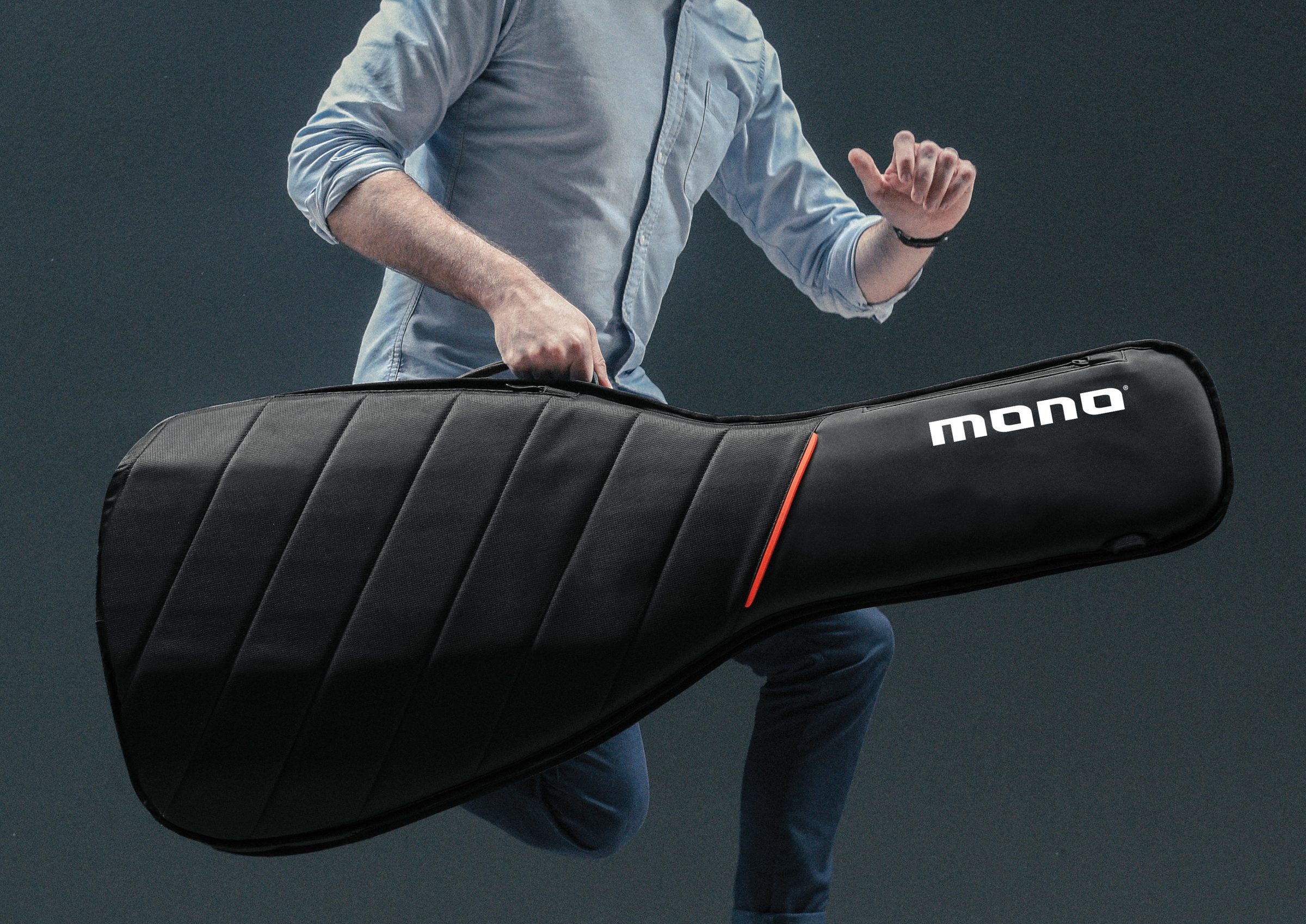
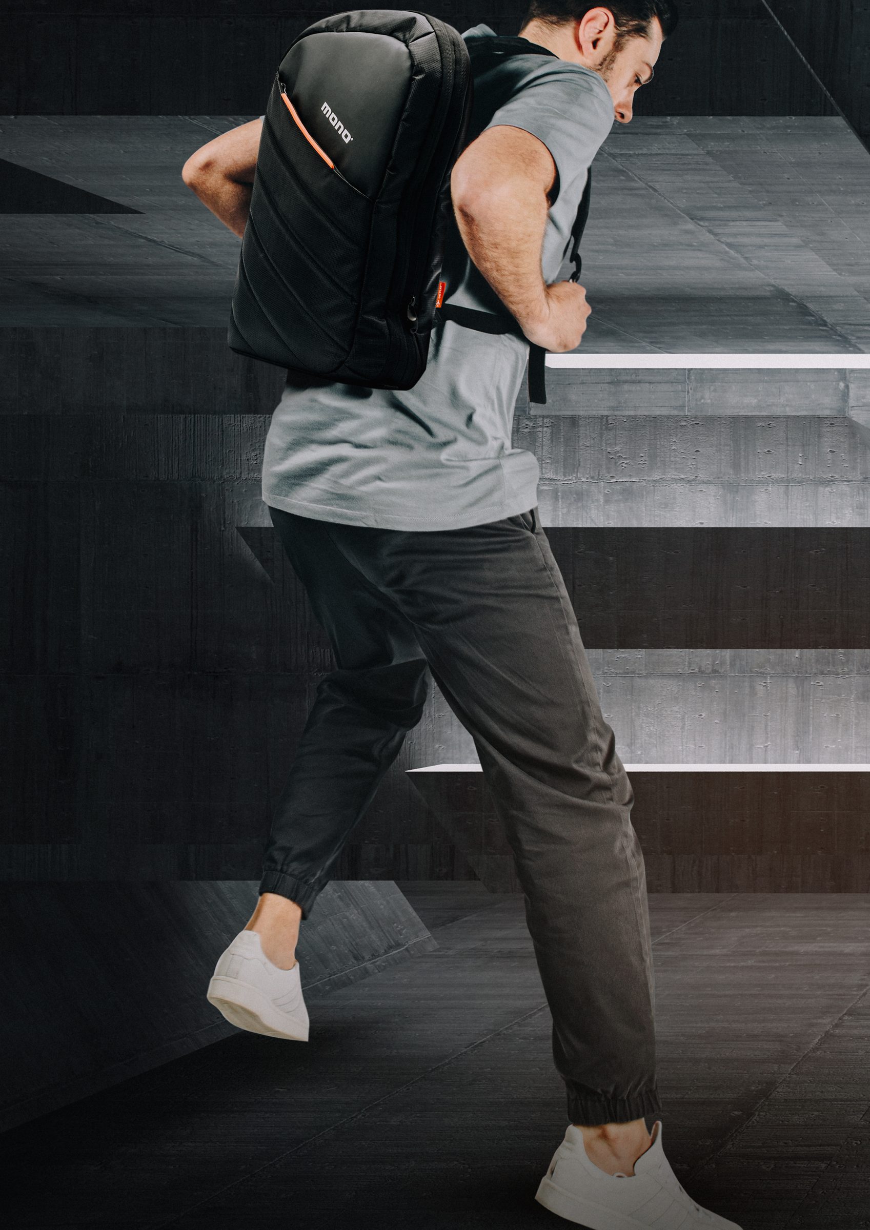
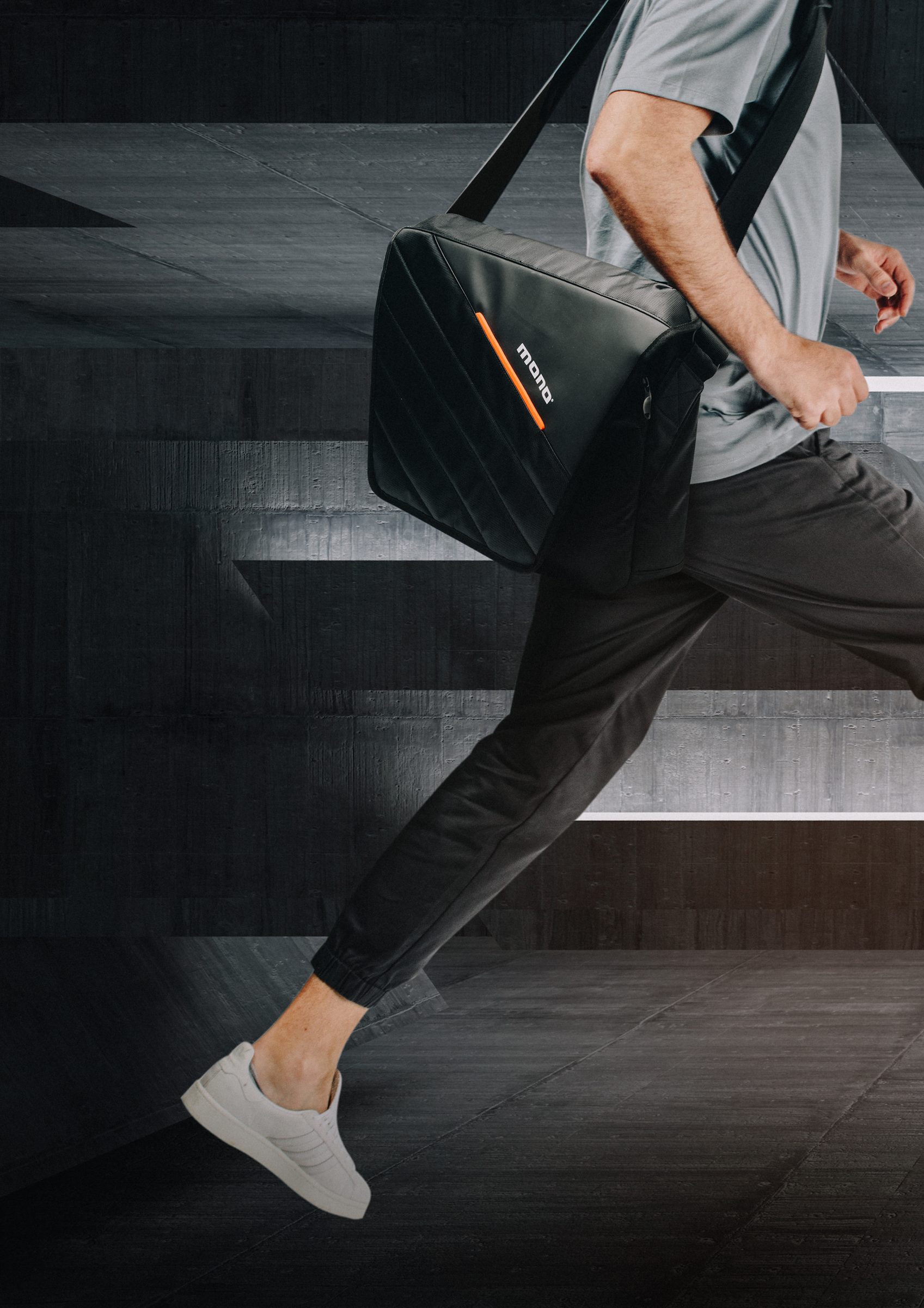
Product Photography
Sleek and product-centric — cases shot on dark, neutral backgrounds, the signature orange accent set against matte black. Active musicians, real touring life.
Typography
Trade Gothic is the corporate typeface. Trade Gothic Bold is used for headlines and emphasis — generally set in uppercase — while Trade Gothic Light handles body copy in sentence case. Roboto Regular is the digital equivalent.
Tone of Voice
MONO isn't just an accessories brand — it's a club that people want to join. We're a knowing nod between two passing musicians: confident, not cocky, with a twinkle in the eye.
The UK's House of
Music & Expression
Opening up a world of tastes, instruments, and services through authentic experiences that inspire and welcome all — a most trusted house of music retail since 1898.

Vision, Mission & Promise
The core statements that define Dawsons' purpose, direction, and relationship with the musicians it serves.
Brand Personality
Three traits that shape every word, design choice, and interaction Dawsons puts into the world.
Asset Bank
Search, preview, and download every Dawsons asset — the main lockup in all colourways, the isolated wordmark, patch lockups, sub-brand marks, and the full brand guideline. Filter by type, variant, or format.
Colour Palette
A warm, characterful palette built on three tiers — Hi-Hat gold leads; Analog cream and White support; Tempo, Record, and Fuzz add depth and accent. Use the ratios as a guide, and always follow the exact colour codes — never sample, extract, or convert them.
RGB 159, 138, 70
Pantone 617 C
RGB 248, 244, 233
Pantone 9080 C
RGB 254, 254, 252
RGB 35, 30, 24
Pantone 419 C
RGB 223, 83, 52
Pantone 2027 C
RGB 176, 197, 203
Pantone 277 C
Typography
The brand identity uses two typefaces — Garnett (Semibold, Bold, and Black) for headings, and Lato for body copy. When Garnett is unavailable, use Work Sans as a substitute.
America's Most Loved House of
Music & Expression
A legendary New York music store since 1935 — opening up a world of tastes, instruments, and services through authentic experiences that inspire and welcome all.

Vision, Mission & Promise
The core statements that define Manny's purpose, direction, and relationship with the musicians it serves.
Brand Personality
Three traits that shape every word, design choice, and interaction Manny's puts into the world.
Asset Bank
Search, preview, and download every Manny's asset — the URL lockup in all colourways, the seal and stamp lockups, patch marks, and the full brand guideline. Filter by type, variant, or format.
Colour Palette
A warm, characterful palette built on three tiers — Hi-Hat gold leads; Analog cream and White support; Tempo, Record, and Fuzz add depth and accent. Use the ratios as a guide, and always follow the exact colour codes — never sample, extract, or convert them.
RGB 159, 138, 70
Pantone 617 C
RGB 248, 244, 233
Pantone 9080 C
RGB 254, 254, 252
RGB 35, 30, 24
Pantone 419 C
RGB 223, 83, 52
Pantone 2027 C
RGB 176, 197, 203
Pantone 277 C
Typography
The brand identity uses two typefaces — Garnett (Semibold and Black) for headings, and Lato for body copy. When Garnett is unavailable, use Work Sans as a substitute.
The World's Premier Trusted Partner for
Pre-Loved Instruments
Guiding the seamless buying and selling of pre-loved musical instruments — preserving the legacy of young and old, and delivering confidence with every piece.

Vision, Mission & Promise
The core statements that define Well Played Gear's purpose, direction, and relationship with the buyers and sellers it serves.
Brand Personality
Three traits that shape every word, design choice, and interaction Well Played Gear puts into the world.
Asset Bank
Search, preview, and download every Well Played Gear asset — the primary badge, horizontal logotype, responsive mark, favicon, and the full brand book. Filter by type, variant, or format.
Colour Palette
A clean monochrome palette — black and white anchored by a considered range of greys. Always follow the exact colour codes; never sample, extract, or convert them.
RGB 0, 0, 0
PMS Black C
RGB 58, 58, 58
RGB 122, 122, 122
RGB 207, 207, 207
RGB 255, 255, 255
Logo Suite
A flexible system — the primary seal badge, the horizontal logotype, and a responsive mark for small formats and avatars.


Typography
Bell MT is the headline typeface for print, with Times New Roman as its digital equivalent — classic serifs that signal trust and heritage. Alegreya Sans is the body-copy font across both print and digital.
NME Networks
CMG's media division — operating the world's most trusted music editorial brands that inform, inspire and connect music fans everywhere.

Logos
Download the NME Networks logo in black and white, available as SVG and PNG. Use the white logo on dark backgrounds and the black logo on light backgrounds.
The World's Defining Voice in
Music & Pop Culture
Breaking what's new and what's next since 1952 — creating and curating the content, products, and experiences essential to music and pop-culture fans today.
Vision, Mission & Promise
The core statements that define NME's purpose, direction, and relationship with music and pop-culture fans.
Brand Personality
Three traits that shape every word, design choice, and interaction NME puts into the world.
Asset Bank
Search, preview, and download the NME logo, its regional lockups (Australia, Asia), NME Shop, and editorial franchise marks. Filter by type, variant, or format.
Colour Palette
Our colours are what give us personality — bold and unmistakable. NME Red leads, with an electric yellow accent, anchored by black and white. Always follow the exact colour codes; don't convert between colour profiles.
RGB 226, 0, 26
CMYK 5, 100, 100, 1
RGB 252, 255, 0
CMYK 0, 0, 90, 0
RGB 0, 0, 0
CMYK 0, 0, 0, 100
RGB 255, 255, 255
Tone of Voice
When something's great, we shout about it. When something misses the mark, we shout about it too — because we care deeply. NME speaks with the credibility of 70+ years and the energy of now.
Typography
NME uses Helvetica Neue across the brand — Bold and Black for punchy, confident headlines, and Roman / Light for clean, highly legible body copy.
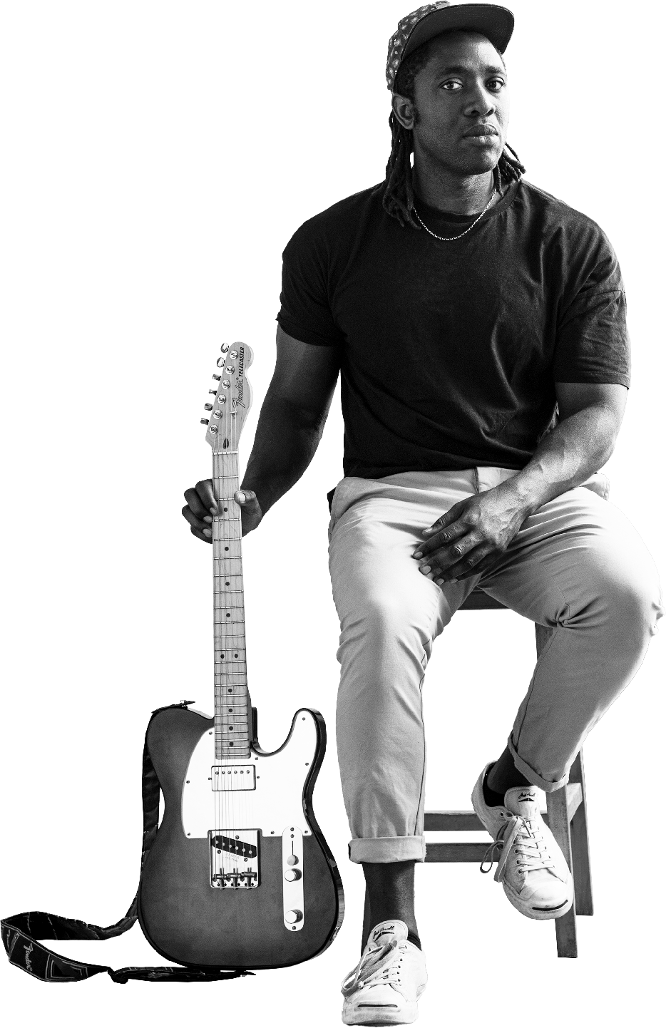
The Destination for
All Things Guitar
Experiences for guitarists, music obsessives, and the industry — fuelling a passion for guitar culture and inspiring the next generation of enthusiasts.

Vision, Mission & Promise
The core statements that define Guitar.com's purpose, direction, and relationship with the guitar community.
Brand Personality
Three traits that shape every word, design choice, and interaction Guitar.com puts into the world.
Asset Bank
Search, preview, and download the Guitar.com logo suite — primary logotype, secondary lockups (outline, dropshadow, acid), and the headstock icon in every colourway. Filter by type, variant, or format.
Colour Palette
A bold core palette of four — Black, White, Acid Yellow, and Bright Blue. Follow the 1/3 rule: only a third of any composition should be coloured — black and white are integral to the brand's equity.
RGB 224, 255, 23
RGB 7, 235, 235
RGB 0, 0, 0
RGB 255, 255, 255
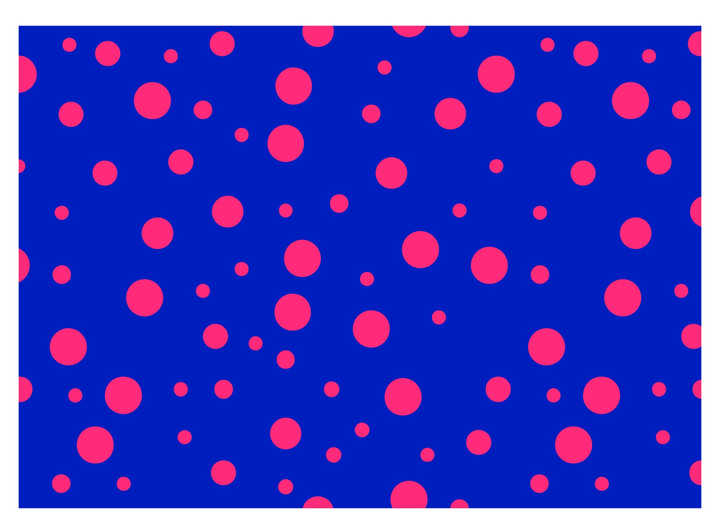
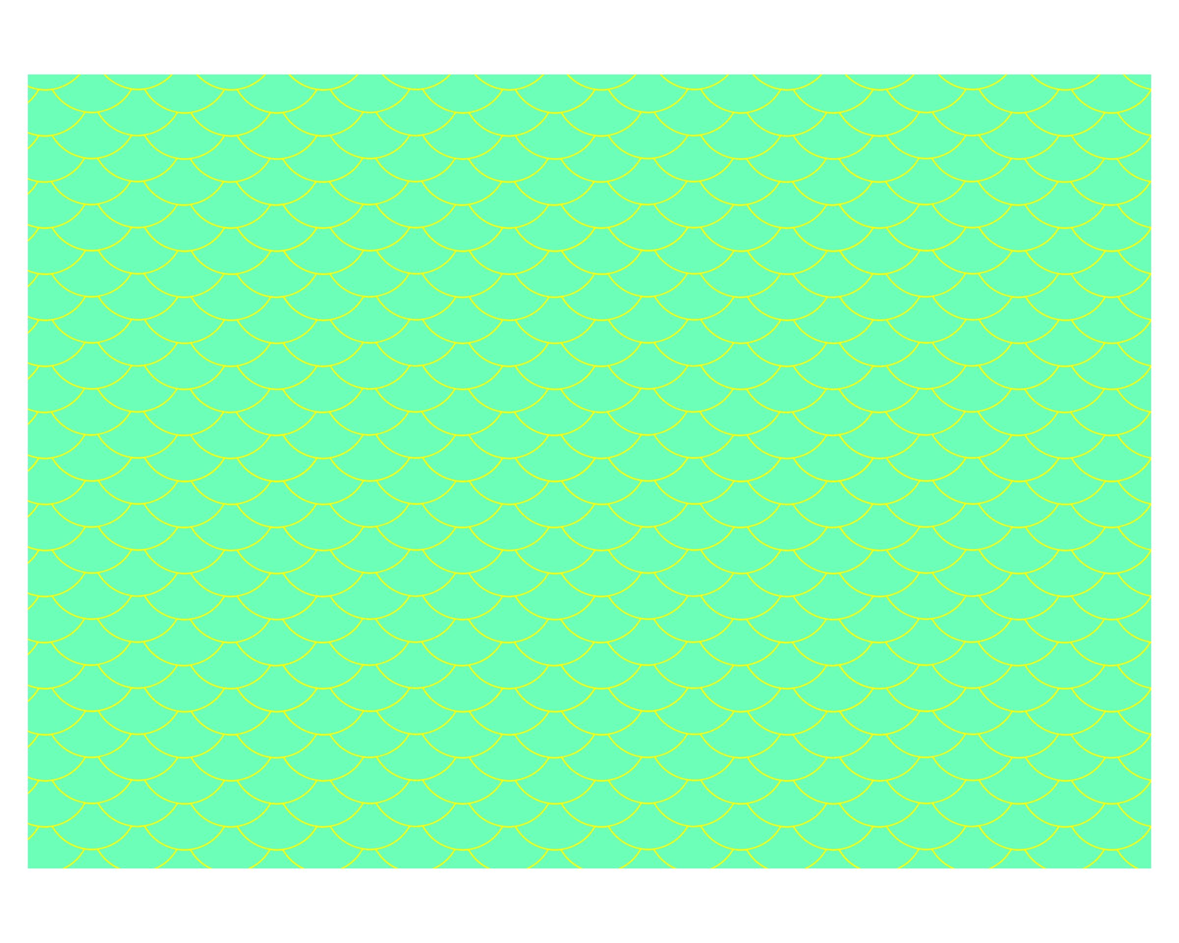
Patterns
Drawn from the DIY poster and album artwork of early punk and skate culture — halftones, high-contrast shapes, and duotone palettes that emphasise motion and character. Four core patterns: Checker Bulge, Stripes, Circle Wave, and Checker Flag.


Typography
PP Formula is the primary typeface — a bold, racy display face with the flexibility of a grotesque (Semi-Extended Bold for headlines, Extended Bold for eyebrows, Medium for sub-heads). PP Neue Montreal handles body copy.
Tone of Voice
Guitar.com speaks fluent guitar — knowledgeable and passionate, with the DIY energy of punk and skate culture. The first to know, and never afraid to show who we are.
At the Intersection of
Music & Technology
The leading media brand for music production and technology — expert reviews, tutorials, and news for producers, engineers, and creators.

Vision, Mission & Promise
The core statements that define MusicTech's purpose, direction, and relationship with music creators.
Brand Personality
It's okay to have some personality — if we're having fun with the brand, the audience will feel it and have fun too. Three traits that shape everything MusicTech makes.
Asset Bank
Search, preview, and download the MusicTech logo — black, white, and the three gradient colourways — plus the MT icon. Filter by type, variant, or format.
Marquee Colours
Three signature gradients — Cyan & Magenta, Green & Yellow, and Red & Yellow — used for covers, art, marketing, headlines, and section headers. Each pairs a vivid hue with white. Always use the exact colour codes.
Magenta #F0A0EE · PMS 251 C
Yellow #FEFFA2 · PMS 600 C
Yellow #FEFFA2 · PMS 600 C
RGB 18, 18, 17
RGB 255, 255, 255
Grain
Grain is good. A subtle film-grain texture runs across imagery and colour fields to make everything feel more human and tactile — a core part of the MusicTech look.
Typography
GT Flexa is the primary typeface — a fluid, extensive grotesk system spanning compressed to expanded widths, with sharp ink traps and a unique personality. Roboto handles body copy, with Roboto Mono for technical labels.
Tone of Voice
MusicTech is the expert friend in the studio — knows the gear cold, tells it straight, and still has fun doing it.